Case Study 01
Rethinking the Home & Garden App
Transforming product, team architecture & AI prototyping across a 3-year ecosystem journey.
Not only was the legacy app failing — so was the way it was built. This is how a new team architecture, a design-system foundation, and an AI-powered prototyping pipeline rebuilt both the product and the process behind it.
- Role
- Lead UX Consultant & Prototyping Architect
- Timeline
- 3+ years — ongoing initiative
- Team & Governance
- 1× UX Lead, 1× Guidelines / Design System Architect, N Application Designers (robotics, irrigation, e-commerce…)
- Tools & Tech
- Figma, v0 (Vercel), Zeroheight, Jira
Impact at a glance
01 · The status quo — the legacy era
At the start of the initiative the Home & Garden app was in serious trouble. The problems ran deeper than the interface: both the product and the way the design team worked behind the scenes lacked any durable structure.
The symptoms in the product
- App Store rating 2.8 ★: Frustrated users, drop-offs while pairing IoT devices, and confusing menus.
- Feature sprawl: The product had grown as a collection of isolated functions — with no unified navigation or interaction concept.
- UI & tech debt: Dated interfaces, inconsistent spacing, and a weak visual hierarchy.
The causes in the organization & process
- No guidelines, no design system: Every new function was drawn from scratch — producing dozens of variants of the same buttons, inputs, and modals.
- Figma & permission chaos: No project structure, component drafts stored locally, no versioning standard, and unclear edit/view rights for stakeholders.
- Silo work: Product owners from the hardware divisions (e.g. mowers vs. irrigation) worked in isolation from the e-commerce and app teams.
02 · The transformation architecture
To make the app scalable for the long term we didn’t just rework the interface — we restructured the entire UX organization around a clear governance model that stays consistent while responding fast to product demands.
1× UX Lead — governance & alignment
Strategic direction, stakeholder alignment, process governance, and orchestration across the whole initiative — the role I owned as the single point of accountability for UX quality.
The team beneath the lead
1× Guidelines & System Architect
Owns maintainability, token architecture, pattern libraries, and the Zeroheight documentation — the guardian of the system.
N × Application Designers
One dedicated designer per domain — e.g. robotics, smart irrigation, high-pressure washers, and e-commerce — designing deep within their field.
Stakeholder alignment & meeting culture
Weekly UX / PO alignment
A regular sync with the hardware product owners to surface roadmap dependencies early.
Cross-functional design reviews
Shared feedback loops with developers, product owners, and e-commerce teams before every sprint sign-off.
03 · Feature creation & dual-track agile
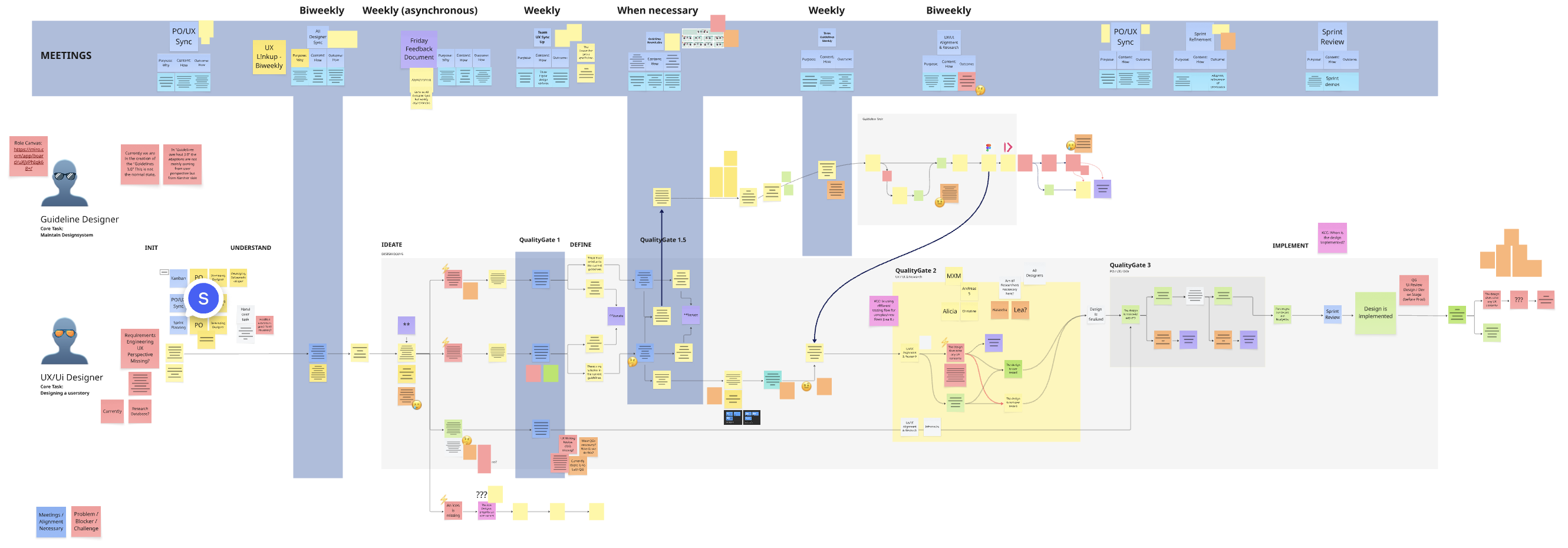
A key element of the transformation was introducing two distinct paths to feature development — so routine iteration and brand-new product categories each get the right level of rigor.
Path 01
Standard feature flow — agile sprints
For established modifications and iterative UI components, the UX process runs in sync with the two-week development sprints. Dual-track agile keeps the discovery sprint one step ahead of the delivery sprint.
- Discovery
- Design
- Delivery sprint
- Ship
Path 02
New product integrations — Google Design Sprint
When an entirely new product category (e.g. a new autonomous robot) enters the ecosystem, the five-day Google Design Sprint is used to de-risk it before any estimate is made.
- Map & target
- Sketch
- Decide
- Prototype
- User test
The advantage: before any effort estimate lands in the dev sprints, a valid concept — already tested with real users — is on the table.
04 · Continuous research & multi-level testing
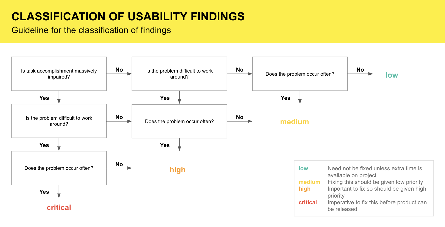
Quality assurance was anchored as a fixed part of the design lifecycle, split across two testing levels — one before development, one live in production.
Concept & UX testing
Method & scope
Figma prototypes and usability labs with target-group readings.
Goal
Identify navigation hurdles and wording misunderstandings before development starts.
Live product testing
Method & scope
A/B testing, telemetry analysis, in-app NPS, and micro-surveys.
Goal
Verify conversion (shop), drop-off (IoT pairing), and long-term usage in live operation.
05 · System architecture, guidelines & Figma governance
Design tokens & atoms
Colors, typography, spacing, radii, elevation, and a bespoke icon set — the CI-compliant base every other layer inherits from.
Patterns & base components (web & app)
Universal UI building blocks — buttons, text fields, modals, card containers, and navigation elements — shared across every screen.
Domain-specific components
Highly specialized modules for individual domains — e.g. interactive zone-cleaning maps for robots or irrigation timer dials.
UX Guidelines overview — inventory to semantic system
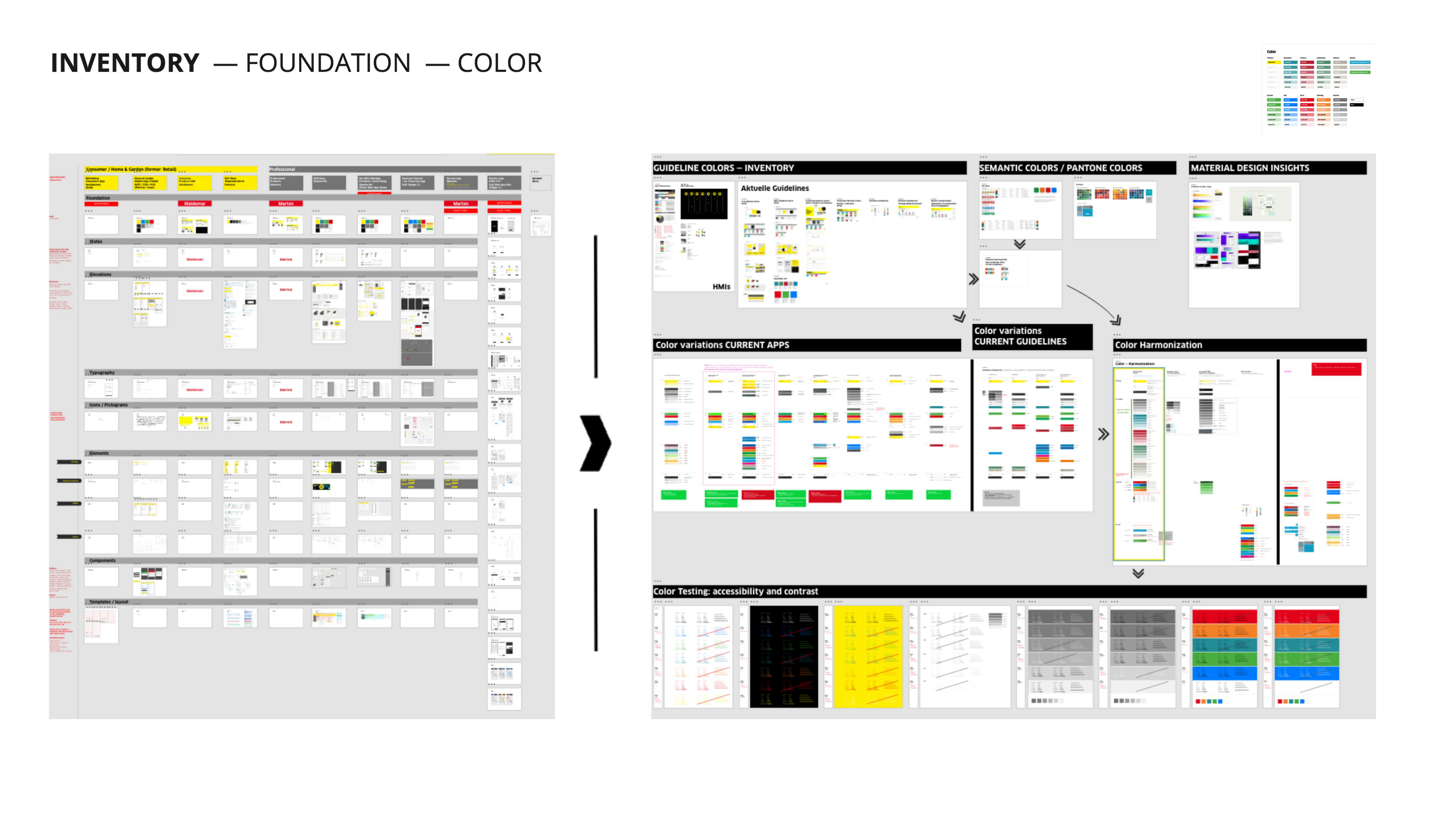
1 / 6Inventory & foundation: color system, from inventory to semantic applications
06 · Documentation
Every component, token, and guideline is documented centrally in Zeroheight — a living reference that pairs the Figma component library with usage rules, do/don’t guidance, interaction specs, and token nomenclature. Developers and designers read from the exact same source, so the system stays consistent as it scales and onboarding no longer depends on tribal knowledge.
07 · Deep dive — next-gen AI prototyping (Figma to v0)
Classic Figma prototypes hit their limits with dynamic IoT data streams, live robot maps, and synchronous device-status messages. Static click-paths couldn’t reflect the complexity of operating real live devices.
The bottleneck
Development cycles for test builds were expensive and time-intensive, and static prototypes under-represented real device behavior — so concepts stayed unvalidated until costly code already existed.
The vibe-coding workflow
The existing Figma component library was connected to AI code generators (v0 by Vercel & Claude): extract the design tokens, hand them to v0’s prompt system, generate interactive React/Tailwind prototypes, feed in real JSON data streams, and validate the running web app on real smartphones — all before the first development sprint.
Token & pattern mapping
Extract Figma design tokens (colors, spacings, Tailwind config) and hand them to v0’s prompt system to configure the prompts.
Vibe coding & iteration
Generate fully interactive React/Tailwind code prototypes through natural language and component references.
IoT data simulation
Wire real JSON data streams (e.g. battery level, live robot position) into the UI components to test genuine data flows.
Stakeholder & user validation
Test the runnable code prototype on real smartphones before the first development sprint begins.
Live prototype
The Kärcher Pilot — the main outcome of this pipeline — built in just a few hours with v0 on top of our existing design system. Explore it live below.
“Fail ultra fast, succeed even faster.”
08 · Impact & retrospective
Year 1
Foundation & restructuring
Consolidated the Figma account, built the core team, released the first modular design system, and fixed the acute pairing hurdles in the app.
Year 2
Scalability & integration
Embedded the Google Design Sprints, introduced the Zeroheight documentation, and reached the 4.0-star mark in the App Store.
Year 3
AI prototyping & ecosystem maturity
Connected the Figma component library to v0 / Vercel (the vibe-coding pipeline), integrated the AI chatbot, and stabilized the rating at 4.6 ★.
09 · Outcome
What began as a failing legacy app is now the reliable control center for Kärcher’s connected Home & Garden devices. Rebuilding both the product and the way it is built lifted the App Store rating from 2.8 to 4.6, cut feedback loops by roughly 70% through v0 code prototypes, and saved hundreds of engineering hours — while the shared design system and Zeroheight documentation keep every new device team shipping consistently. The result is a living ecosystem instead of a one-off release: download it on both major stores.
Download the app